NAVY EXCHANGE
CUSTOMER PROJECT
Duration: 2 Months - 2023
Team: 1 UX Designer
Role: Main UX designer
PROJECT OVERVIEW
Summary:
-
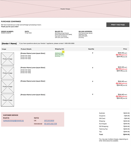
This customer needed a punch-out system design— system in which a supplier allows customers to browse his product catalogs online and then purchase goods or services within the client's e-procurement system. We designed the logic and wireframes for simultaneous checkout from NEXCOM and Home Depot. Working closely with developers, we brought this concept to life.
Problem:
-
How can we design a checkout experience for users shopping from both NEXCOM and Home Depot that avoids confusion and clearly indicates the source of each item?
Users to consider:
-
NEXCOM customers who wants to just purchase the products they want from the NEXCOM site.
-
NEXCOM company who wants to highlight that their affordable product prices.
What we did:
-
Conducted user interviews with NEXCOM to comprehend their use case.
-
Ideated diverse checkout flow designs, seeking customer feedback for refinement.
-
Updated low-fidelity wireframes based on received feedback.
-
Included functional requirements and developed user flow diagrams to clarify logic and aid developers in understanding interactive elements.
Project Contraints:
-
NEXCOM already had an ongoing checkout design implementation, seeking to incorporate a dual checkout feature without a complete overhaul. With limitations on design changes, our approach focused on working within the existing design framework, making minimal adjustments to ensure a positive user experience. Thus, we utilized lean UX methodology.
RESEARCH
User Interview
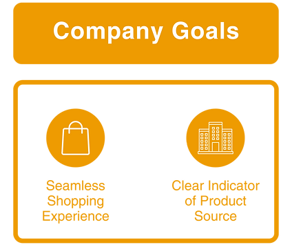
In our initial meeting with the Family Dollar team, we aimed to understand their goal:
Competitive Analysis
We researched popular eCommerce websites, particularly those with split shopping options, to gather insights and identify best practices for our design.
Home Depot
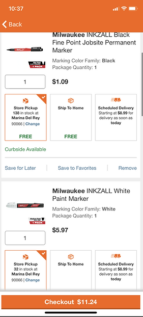
Not Grouping items by fulfillment type could be easier to implement but loses clarity
Target
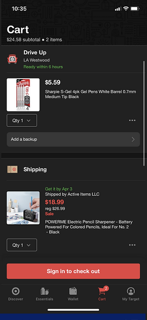
Grouping items by fulfillment type adds clarity
eCommerce UX Research (baymard.com)
We found UX research on mobile checkout best practices and identified key reasons for cart abandonment to address NEXCOM's goal of maximizing profit. Top reason shown below:
Logic Flow (Click to Zoom)
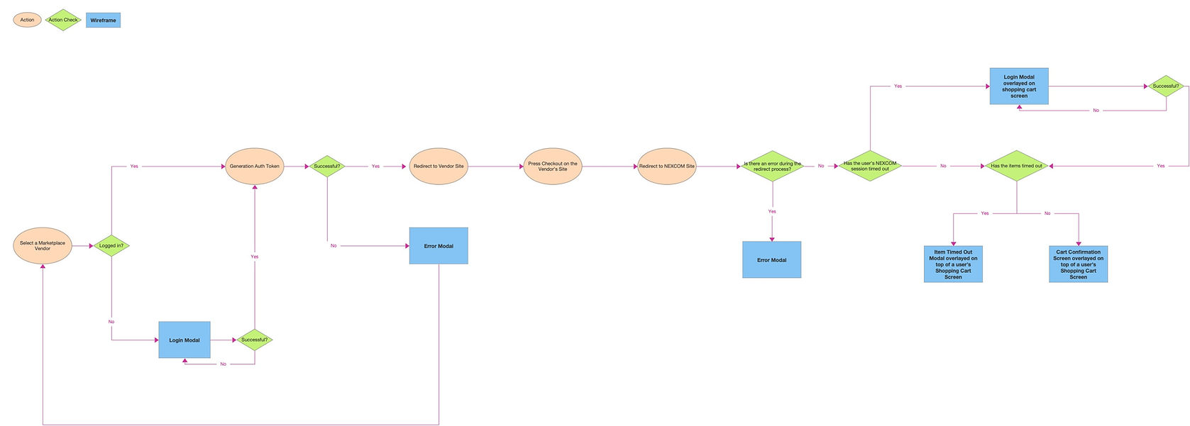
I created a flow diagram to bring clarity to a complex set of business requirements. To make sure we would not be missing any wireframes
Key:
-
Orange: Actions
-
Green: Action Check
-
Blue: Wireframe
DESIGN
User Persona
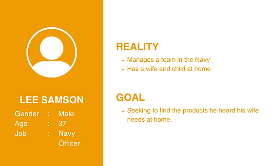
Based on the interview with the NEXCOM employee, we concluded that a typical NEXCOM persona can look like such:
User Goals
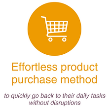
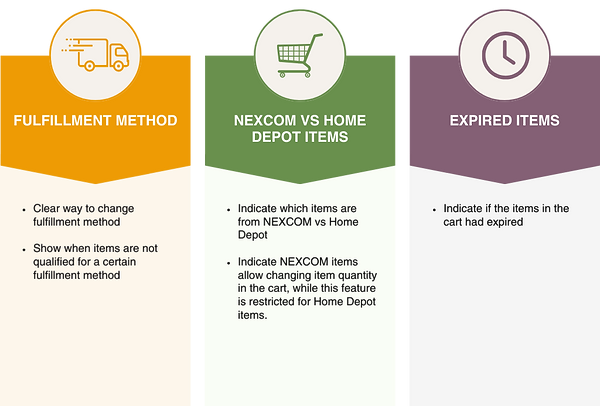
Based on all the research and the user persona, these were the goals we had in mind as we started designing:
Design Ideation
We focused extensively on the checkout flow, aiming to figure out how to showcase all the relevant information while maintaining an easily digestible format:
.png)
NOTE: All of the design ideation for the checkout flow is not included
Final Low Fidelity Designs
We focused extensively on the checkout flow, aiming to figure out how to showcase all the relevant information while maintaining an easily digestible format:
Expired Shopping Cart - Low Fid Wireframes (Click to zoom)
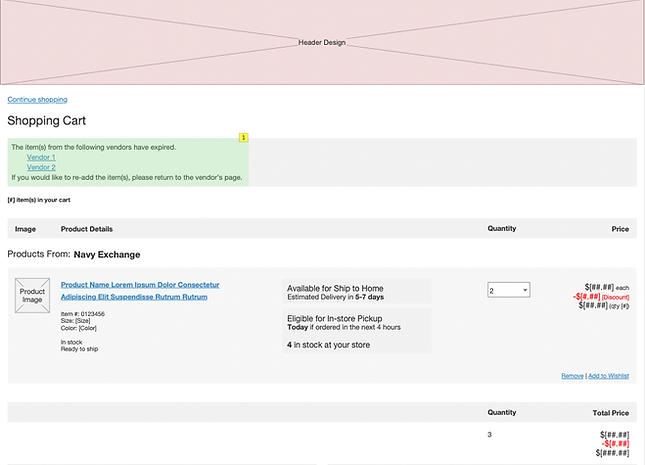
Cart Expiration notification
Shipping- Low Fid Wireframes (Click to zoom)
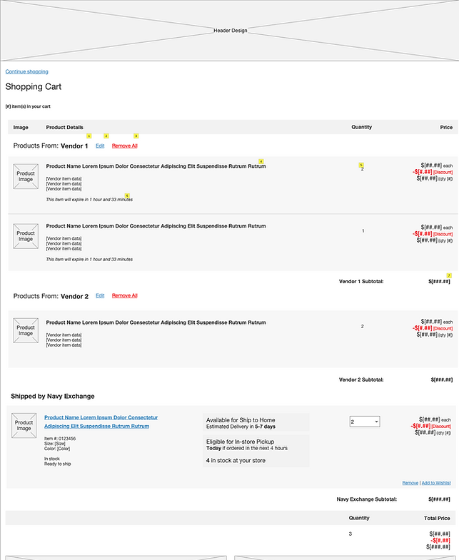
Ability to edit external vendor items
Grouping by vendor
Ability to edit internal vendor items
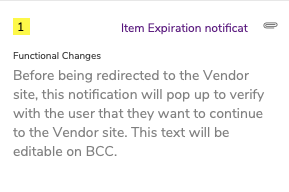
Redirect Notification - Low Fid Wireframes (Click to zoom)
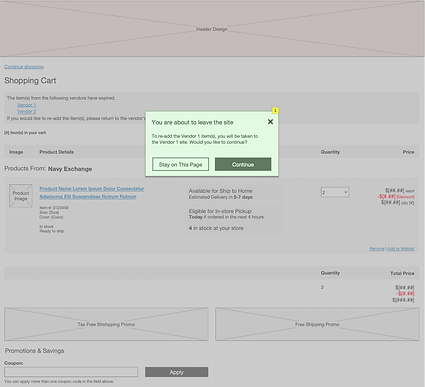
Functional Annotation
RESULTS
Solution Impact
The client expressed satisfaction with the design, and the swift implementation by the engineers was facilitated by the clarity provided in the user flow diagram, addressing any questions they may have had about the user flow